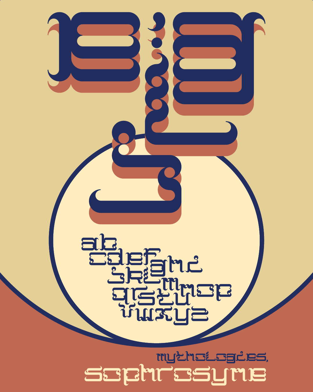
For my final project, I wanted to revisit making typefaces. One thing I have realized during this class is that I am excited about abstraction, especially in text. Language itself is arbitrary, and the markings we associate with sounds are totally abstract, at least in the Latin alphabet. I am also interested in modular design,… Continue reading Final Project: Mythologies
Category: Typography
Exercise 11: Sound Class Poster
I was given just over an hour to create a poster for one of my University class next semester. I was assigned to use Didot, red, and the class "Sound." My main thought when brainstorming was to incorporate a sine wave. To do this, I tried manipulating the "S" in a repeating, overlapping pattern. Having… Continue reading Exercise 11: Sound Class Poster
Typeface Video Project
https://vimeo.com/372776425 I made a video exploring the history and influence of Akzidenz-Grotesk. It is such an old typeface but still looks sleek and modern. My main creative decisions were to show Berlin in the year 1900 and have text over the video. This was because Akzidenz-Grotesk was created for advertising to be used both over… Continue reading Typeface Video Project
Exercise 10: HTML Quote Design
Exercise 9: Non-digital Type
Except for the 3D type project, I had only worked with digital type. I chose to use a typewriter. I thought it was interesting how the typewriter has influenced writing, art, technology and computers. They are simple machines but could be considered analog computers as their inputs and outputs can be purely mechanical. This got… Continue reading Exercise 9: Non-digital Type
Exercise 8: Invisible Man Book Cover
The visual style for this assignment was inspired by Saul Bass. I used motifs from the book including coins, eyes, and the significant red, black, and white colors. Since the book has themes of surveillance, I initially wanted the composition to feature an eye with a spotlight across the page. However, this was a little… Continue reading Exercise 8: Invisible Man Book Cover
Exercise 7: Poetry Redesign
Here I redesigned "Daffodils" by William Wordsworth with the intent of exploring concrete poetry. The layout may look chaotic, but the words are placed as if walking around this nature scene that Wordsworth is describing in the poem. It starts at the top left corner, swoops down, rises along the middle of the page, shoots… Continue reading Exercise 7: Poetry Redesign
Exercise 6: 3D Typography
So far, I had only been working with digital 2D type. For this assignment, we had to make it tangible in some way. I knew that I wanted to do something with perspective and distorting the word. I planned out the structure first, knowing that I would use a laser cutter for this project. I… Continue reading Exercise 6: 3D Typography
Exercise 5: Menu Redesign
For this assignment, we were given the task to redesign this menu: I was assigned to use Baskerville and paired it with Franklin Gothic.
Exercise 4: Sincerity Mark
We looked at the infamous "sarcasm" mark and other alternate punctuation marks. I tried my hard at making a sincerity mark. I chose to have the form be smooth and inviting, like a hug. I modeled it after Georgia but do not like how it turned out. It looks too blobby and takes too much… Continue reading Exercise 4: Sincerity Mark